Creating an effective poster for a scientific conference requires a balance between content clarity, visual appeal, and audience engagement [1,3]. The following principles are widely supported in the literature on scientific communication and information design:
Keep it simple and focused: Choosing a clear, concise title and focusing on a single central message improves comprehension and recall, particularly in time-limited viewing contexts such as poster sessions [3,6]. Conference attendees typically spend only a few minutes at each poster, making immediate clarity essential [4].
Use a logical structure: Organising posters using a familiar scientific structure (Introduction, Methods, Results, Discussion, Conclusion) supports cognitive processing and helps readers navigate the content efficiently [1,7]. Clear headings and sub-headings act as visual signposts, improving information retrieval [6].
Limit text, maximise graphics: Excessive text reduces engagement and readability, whereas visual representations such as graphs and diagrams allow complex data to be understood more rapidly [3,8]. Studies of visual cognition suggest that limiting text and prioritising figures enhances comprehension and memory [9].
Prioritise readability: Large font sizes and simple, sans-serif fonts improve legibility at a distance and reduce visual fatigue [4,10]. Adequate contrast between text and background is essential for accessibility and rapid information processing [9].
Optimise colour usage: Strategic colour use can guide attention and reinforce structure, but excessive or poorly chosen colours may distract or confuse viewers [8,9]. Consideration of colour-vision deficiencies is recommended to ensure accessibility [10].
Include high-quality visuals: High-resolution figures with clear labels and legends are essential for accurate interpretation of results [7]. Well-designed graphics can function as stand-alone summaries of findings, supporting rapid understanding [8].
Align elements and use white space: Consistent alignment and effective use of white space reduce cognitive load and improve visual flow, making posters easier to scan and interpret [6,9].
Engage with a strong introduction and conclusion: A brief contextual introduction helps viewers understand the relevance of the work, while a clear conclusion reinforces the key take-home message and implications [1,3].
Prepare for interaction: Poster presentations are interactive by nature. Including contact details facilitates follow-up and collaboration, while preparing a short verbal explanation enhances engagement during poster sessions [2,4].
Proofread and test: Errors in grammar, spelling, or figure labelling undermine credibility and distract from the scientific message [7]. Pilot viewing of posters from a distance is recommended to ensure readability and coherence [4].
While many guidelines describe what makes a good poster, effective execution remains challenging [3,5]. To engage your audience, posters should make clear, explicit statements supported by the data, while avoiding unnecessary detail [6]. Making contact information visible and being present to discuss the work further enhances the poster’s impact as a scientific communication tool [2].
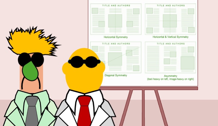
By following these principles, authors can create visually appealing, professional posters that effectively communicate research findings to conference audiences [1,3]. Our guide also highlights useful online resources and free poster templates (portrait and landscape), as well as a poster design selector [5].
References

Get our latest news and publications
Sign up to our news letterResources
Social


Contact us
Address
Niche Science & Technology
Unit 26 Falstaff House
Bardolph Road
Richmond TW9 2LH
United Kingdom
