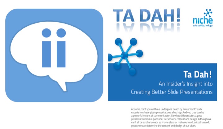
We are delighted to share our latest Insider’s Insight: a practical guide to creating better slide presentations. This is one of the resources we are most proud of—not because it promises dazzling animations or theatrical design tricks, but because it tackles a universal professional problem with honesty and usefulness.
Almost everyone has endured what is commonly called “death by PowerPoint.” Endless bullet lists, unreadable charts, crowded slides, and presenters who simply read text aloud have all contributed to presentations earning an unfairly negative reputation. Yet presentations themselves are not the problem. When designed thoughtfully, they remain one of the most effective tools for communicating complex ideas, supporting decision-making, and facilitating shared understanding [1][2].
The difference between a poor presentation and a memorable one is rarely the software used. It lies in how well the presenter understands the psychology of communication. Human working memory is limited; overloaded slides force audiences to divide their attention and reduce comprehension [1]. Research in multimedia learning consistently shows that people learn more effectively when information is presented with clarity, relevance, and balance between words and visuals [2]. In short, good slides do not compete with the speaker, they reinforce the message.
That is why we encourage every presentation to be viewed as a multi-dimensional project. Each element, typography, bullets, text, colour, images, and themes—must work in harmony. These are not decorative extras; they are structural components of understanding. Typography affects readability. Colour influences attention and emotional tone. Images support memory through dual coding, where visual and verbal information strengthen one another [3]. Themes create consistency, reducing distraction and allowing audiences to focus on substance.
Our guide does not attempt to make you a better public speaker, nor can it replace expertise in your subject matter. What it can do is ensure that your slides serve your presentation rather than sabotage it. The aim is practical excellence: first-class slides that clarify, simplify, and elevate your message.
When we first considered writing this Insider’s Insight, we debated whether to ‘show’ rather than ‘tell.’ Many existing guides rely on spectacular examples, beautifully designed slides that look impressive but are often impossible to reproduce in everyday business or scientific settings. The result is inspiration without application.
We chose a different route [4].
Instead of creating a gallery of polished but unrealistic examples, we focused on producing a concise, evidence-informed document in which every sentence delivers practical value. The intention was not to impress designers, but to empower professionals. We wanted to provide insight rather than spectacle; principles rather than gimmicks.
This matters because sustainable improvement does not come from isolated tips scattered across websites, books, and workshops. It comes from having trusted, well-curated resources gathered in one place, accessible when needed, and shared freely. That is the true strength of this guide, and of the wider Insider’s Insight collection. By consolidating high-value knowledge into practical documents, we reduce the time people spend searching and increase the time they spend applying. In knowledge-driven industries, this kind of organised accessibility is not merely convenient, it is transformative [5][6].
Freely shared resources also create something larger than individual benefit: they foster a culture of collective improvement. When expertise is openly distributed rather than closely guarded, organisations and communities become stronger, more efficient, and more innovative [6].
As you download this guide, we encourage you to explore the other Insider’s Insights available. Each has been developed with the same commitment: useful, evidence-aware, and immediately applicable. We welcome suggestions for improvement, as well as requests for future topics.
After all, the best knowledge is not knowledge kept, it is knowledge shared.
References

Get our latest news and publications
Sign up to our news letterResources
Social


Contact us
Address
Niche Science & Technology
Unit 26 Falstaff House
Bardolph Road
Richmond TW9 2LH
United Kingdom
