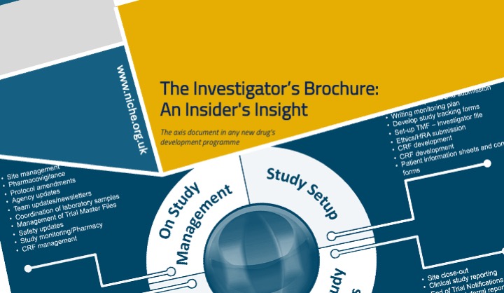
Posters are an excellent opportunity to showcase your work, stimulate feedback, and build your research network [1,2]. However, many scientific posters contain excessive text and fail to communicate their key message clearly, limiting their effectiveness as communication tools [3,4]. In our recent
Insider’s Insight we provide instructions on how to produce effective posters [5]. In brief:
Creating an effective poster for a scientific conference requires a balance between content clarity, visual appeal, and audience engagement [1,3]. The following principles are widely supported in the literature on scientific communication and information design:
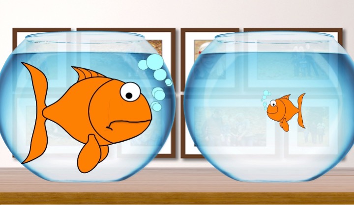
Keep it simple and focused: Choosing a clear, concise title and focusing on a single central message improves comprehension and recall, particularly in time-limited viewing contexts such as poster sessions [3,6]. Conference attendees typically spend only a few minutes at each poster, making immediate clarity essential [4].
Use a logical structure: Organising posters using a familiar scientific structure (Introduction, Methods, Results, Discussion, Conclusion) supports cognitive processing and helps readers navigate the content efficiently [1,7]. Clear headings and sub-headings act as visual signposts, improving information retrieval [6].
Limit text, maximise graphics: Excessive text reduces engagement and readability, whereas visual representations such as graphs and diagrams allow complex data to be understood more rapidly [3,8]. Studies of visual cognition suggest that limiting text and prioritising figures enhances comprehension and memory [9].
Prioritise readability: Large font sizes and simple, sans-serif fonts improve legibility at a distance and reduce visual fatigue [4,10]. Adequate contrast between text and background is essential for accessibility and rapid information processing [9].
Optimise colour usage: Strategic colour use can guide attention and reinforce structure, but excessive or poorly chosen colours may distract or confuse viewers [8,9]. Consideration of colour-vision deficiencies is recommended to ensure accessibility [10].
Include high-quality visuals: High-resolution figures with clear labels and legends are essential for accurate interpretation of results [7]. Well-designed graphics can function as stand-alone summaries of findings, supporting rapid understanding [8].
Align elements and use white space: Consistent alignment and effective use of white space reduce cognitive load and improve visual flow, making posters easier to scan and interpret [6,9].
Engage with a strong introduction and conclusion: A brief contextual introduction helps viewers understand the relevance of the work, while a clear conclusion reinforces the key take-home message and implications [1,3].
Prepare for interaction: Poster presentations are interactive by nature. Including contact details facilitates follow-up and collaboration, while preparing a short verbal explanation enhances engagement during poster sessions [2,4].
Proofread and test: Errors in grammar, spelling, or figure labelling undermine credibility and distract from the scientific message [7]. Pilot viewing of posters from a distance is recommended to ensure readability and coherence [4].
While many guidelines describe what makes a good poster, effective execution remains challenging [3,5]. To engage your audience, posters should make clear, explicit statements supported by the data, while avoiding unnecessary detail [6]. Making contact information visible and being present to discuss the work further enhances the poster’s impact as a scientific communication tool [2].
By following these principles, authors can create visually appealing, professional posters that effectively communicate research findings to conference audiences [1,3]. Our guide also highlights useful online resources and free poster templates (portrait and landscape), as well as a poster design selector [5].
References
- Rowe N, Ilic D. What impact do posters have on academic knowledge transfer? A pilot survey on author attitudes and experiences. BMC Med Educ. 2009;9:71.
- Rowe N, Ilic D. Poster Presentation – a visual medium for academic and scientific meetings. Paediatr Respir Rev.2011;12(3):208–213.
- Hess GR, Tosney KW, Liegel LH. Creating effective poster presentations: AMEE Guide No. 40. Med Teach. 2009;31(4):319–321.
- Day RA, Gastel B. How to Write and Publish a Scientific Paper. 6th ed. Cambridge: Cambridge University Press; 2006.
- Niche Science & Technology Ltd. An Insider’s Insight into Poster Presentations. 2014.
- Gopen GD, Swan JA. The science of scientific writing. Am Sci. 1990;78(6):550–8.
- Zeiger M. Essentials of Writing Biomedical Research Papers. 2nd ed. New York: McGraw-Hill; 2000.
- Tufte ER. The Visual Display of Quantitative Information. Cheshire (CT): Graphics Press; 2001.
- Wickens CD, Hollands JG. Engineering Psychology and Human Performance. 3rd ed. Upper Saddle River (NJ): Prentice Hall; 2000.
- Schriver KA. Dynamics in document design: creating text for readers. New York: Wiley; 1997.