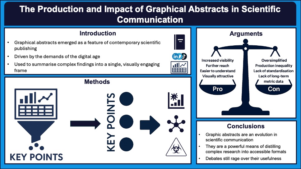
The graphical abstract has emerged as a defining feature of contemporary scientific publishing, positioned at the intersection of visual communication, digital dissemination and scholarly impact. While initially adopted by select journals (like Elsevier) in chemistry and medicine, graphic abstracts are now widely used across disciplines as a mechanism to summarise complex findings into a single, visually engaging frame. Their growing prominence reflects a deeper shift in how research is consumed: rapidly, digitally and often outside traditional academic contexts.
The Visual Abstract Primer (v4.1) provides a structured foundation for understanding how graphic abstracts are produced, emphasising clarity, hierarchy and narrative flow [1]. It frames the graphical abstract not as decoration, but as a ‘translation’ of research into a cognitively palatable format, where the central message is immediately apparent to the viewer [2]. This article builds on this framework exploring both the production process and the ongoing debate surrounding their effectiveness in engaging readers, improving metrics and enhancing dissemination.
The Production of Graphical Abstracts: From Data to Narrative
For me, the creation of a graphic abstract is basically the challenge of ‘conceptual distillation’. As outlined in the Visual Abstract Primer, the first step involves identifying the ‘single take‑home message’ of the study or as I like to put, the ‘Oh’ moment. This message becomes the anchor for the entire visual narrative [3]. I have learned that trick creating visuals is to emphasise on singularity is crucial; adding multiple findings often result in cluttered visuals and a garbled message.
I see the production process as a sequence of transformations. Raw data and detailed results must first be reduced into key points. Then I must turn these key points into visual structures, often following a left-to-right or top-to-bottom flow that mirrors conventional western reading patterns. The Primer highlights the importance of visual hierarchy, where typography, colour and spatial arrangement guide the viewer’s attention [4]. For example, I use larger fonts or bold elements signal primary findings, while secondary details and extra details are intentionally subdued.
When it comes to defining what an effective graphic abstract, for me, it comes down to how they manage narrative coherence. I believe effective graphics abstracts have one key feature: excellent storytelling. These graphic abstracts introduce a problem, a method is implied and a result is revealed in a ‘grand finale.’ This narrative approach aligns with principles of information design, where comprehension is enhanced when content follows a logical progression.
Working with graphic abstracts has shown me that graphic abstracts can also be a double‑edged blade. Simplification risks distortion of your message and can lead to overgeneralisation of conclusions, which the actual data does not fully support. This concern is echoed in broader discussions about ‘science communication as marketing,’ where visual appeal overshadows methodological rigour.
Cognitive and Communicative Advantages
The appeal of graphic abstracts is grounded in cognitive science. Dual coding theory suggests that information presented both visually and verbally is more easily processed and retained. Empirical evidence supports this: visual abstracts have been shown to increase understanding among both clinicians and lay audiences [5]. I, myself, also find it read data as a graph or image compared with tables and text.
Ibrahim et al. demonstrated that articles accompanied by visual abstracts received significantly higher engagement on social media platforms, particularly X (Twitter), versus text‑only summaries [6]. Their randomised controlled trial found an approximate threefold increase in impressions and a higher rate of article visits, suggesting that visual formats can act as effective entry points into more detailed content.
Similarly, O’Kelly et al. reported that visual abstracts improved knowledge retention among medical trainees, reinforcing their educational value [7]. These findings align with the broader shift toward visual learning in digital environments, where attention spans are limited and competition for engagement is intense.
However, I believe that the relationship between engagement and understanding is not straightforward. While visual abstracts may attract attention, they do not guarantee deep comprehension. Some studies I’ve seen suggest that readers may rely on the graphical abstract alone, bypassing the full text entirely. This raises questions about whether graphic abstracts serve to enhance or dumb down scholarly communication. I believe this depends on the skill of your creative side.
Metrics and the Question of Impact
One of the most frequently cited justifications for graphic abstracts is their potential to improve research metrics. Altmetric scores, which track online attention, often increase when visual summaries are used [5]. This has led many journals to adopt graphic abstracts as part of their dissemination strategy.
Yet, the evidence linking graphic abstracts to traditional metrics such as citations is less conclusive. A study by Pferschy-Wenzig et al. found no consistent increase in citation counts for articles with graphic abstracts compared to those without [8]. This suggests that while graphic abstract may boost visibility, their effect on long-term scholarly impact is uncertain.
This distinction between visibility and impact is critical. In the digital ecosystem, visibility can be achieved rapidly through social media amplification, whereas citations accumulate over longer periods and depend on factors such as methodological quality, novelty and relevance to ongoing research.
Online commentary reflects this ambiguity. On platforms such as Bluesky/X, Reddit and academic blogs, graphic abstracts are often applauded for their accessibility and shareability. Users frequently note that they are more likely to stop scrolling when a visual summary is present, highlighting their role in capturing attention. However, others express scepticism, arguing that graphic abstracts are ‘academic clickbait,’ prioritising aesthetics over substance.
These divergent views underscore a central tension: graphic abstracts may function more effectively as promotional tools rather than scholarly instruments. Their value may lie in extending the reach of research rather than deepening its intellectual impact.
Dissemination in the Digital Age
The role of graphic abstracts in dissemination is their most compelling advantage. In an environment dominated by social media and mobile consumption, traditional abstracts are often ill‑suited to rapid sharing. Graphical abstracts, by contrast, are portable and visually optimised for digital platforms.
The Visual Abstract Primer emphasises that graphic abstracts should be designed with dissemination in mind, including considerations such as aspect ratio, font size and colour contrast for mobile viewing ref. This reflects an understanding that the primary audience may encounter the graphic not within the journal itself, but on platforms such as X, LinkedIn or conference presentations.
Empirical studies support the dissemination advantage. Research indicates that tweets containing visual abstracts are significantly more likely to be shared and engaged with than those containing text alone [3]. This amplification effect can extend the reach of research beyond traditional academic audiences, including policymakers, journalists and the public.
However, dissemination is not synonymous with understanding. The brevity and visual nature of graphic abstracts may lead to misinterpretation, particularly when complex findings are reduced to simplified visuals. This risk is compounded by the absence of methodological context, which is often omitted due to space constraints.
I think there could be a balance between findings and visuals. Visuals as a ‘entry point’ to the more in-depth results with the use of links and QR code. I would aim to make the visuals appear more like a ‘lure’, something to hook the reader and, hopefully, reel them into the full manuscript and analysis.
Critical Perspectives and Limitations
Despite their growing popularity, graphic abstracts are not without limitations. One concern is the potential for inequity. Producing high-quality graphic abstracts require design skills, software and time. These resources are not equally available to all researchers. This could create disparities in visibility that are unrelated to the quality of the research itself.
Another issue is standardisation. While the Visual Abstract Primer provides guidelines, there is considerable variation in how graphic abstracts are designed and implemented. This lack of consistency can affect both usability and interpretability.
Critics also point to the risk of oversimplification. Scientific findings are often complex and context-dependent and reducing them to a single image may obscure important nuances. As one widely shared comment on academic social media noted, graphic can ‘flatten uncertainty into certainty,’ potentially misleading readers.
At the same time, proponents argue that all forms of summarisation involve trade-offs. The key question is not whether graphic abstracts are perfect representations, but whether they are effective gateways to deeper engagement. In this sense, their value may depend on how they are used – whether as complements to, rather than replacements for, traditional abstracts.
Conclusion
The production of graphic abstracts represents an evolution in scientific communication, driven by the demands of the digital age. Grounded in principles of visual design and cognitive efficiency, they offer a powerful means of distilling complex research into accessible formats.
Evidence suggests that graphic abstract enhance engagement and improve dissemination, particularly through social media. However, their impact on traditional metrics such as citations remains uncertain and their effectiveness as tools for deep understanding is contested.
Ultimately, I believe graphic abstracts should be viewed not as substitutes for rigorous scientific writing, but as complementary tools that extend the reach of research. Their success depends on careful design, thoughtful simplification and an awareness of their limitations. As the scientific community continues to navigate the balance between accessibility and accuracy, graphic abstracts will remain both a promising innovation and a subject of ongoing debate.
References
- Use of a VISUAL ABSTRACT to Disseminate Scientific Research v4.1. 2018. Editor Ibrahim AM.
- Ramos E and Concepcion BP. Visual Abstracts: Redesigning the Landscape of Research Dissemination. Seminars in Nephrology. 2020; 40 (3): 291-297.
- Millar BC and Lim M. The Role of Visual Abstracts in the Dissemination of Medical Research. Ulster Med J. 2022; 91(2):67-78.
- Lin H, Hsieh YC and Wu FG. A study on the relationships between different presentation modes of graphical icons and users’ attention. Computers in Human Behavior. 2016; 63: 218-228.
- Mayer RE. Multimedia learning. 2nd ed. Cambridge: Cambridge University Press; 2009.
- Ibrahim AM, Lillemoe KD, Klingensmith ME, Dimick JB. Visual abstracts to disseminate research on social media: a randomized controlled trial. Ann Surg. 2017;266(6):e46–e48.
- O’Kelly F, O’Sullivan M, Powell C, et al. The impact of visual abstracts on information dissemination in medical education. Postgrad Med J. 2019;95(1127):e1–e2.
- Pferschy-Wenzig EM, Pferschy U, Wang D, Mocan A, Atanasov AG. Does a graphical abstract bring more visibility to your paper? Molecules. 2016;21(9):1247.