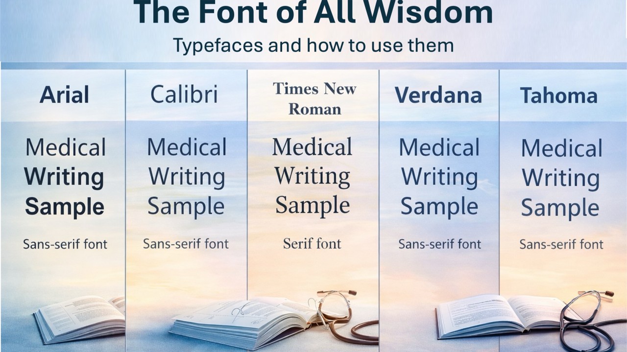
At Niche our medical writers operate within tight typographic constraints — Times New Roman for regulatory submissions, and slightly more exotic fonts (Calibri, Helvetica etc.) for slide decks and posters. These defaults create the impression that typography is simply a formatting requirement and not a strategic communication tool. Yet evidence from perceptual and cognitive research makes it clear that different typographic forms shape how readers perceive, process and respond to text. Letterforms, serifs, spacing and emphasis influence legibility, cognitive load, credibility and even emotional tone. Even when font choices are restricted, understanding the communicative power embedded in typography allows us to make more deliberate, reader-centred decisions that enhance clarity, professionalism and message impact — even within the boundaries imposed by regulatory and scientific norms.
How we process typographic forms
Reading is the product of rapid visual-orthographic processing followed by lexical and semantic integration. Visual legibility, the ability to discriminate characters and letterforms quickly and accurately, is influenced by stroke width, contrast, spacing and the presence or absence of serifs [1,2]. Controlled experiments show that when letterforms approach the limits of acuity (small sizes, low contrast), serif details impede recognition. Under normal sizes and print quality, serif vs sans-serif differences in reading speed are small underlining how many text-level effects depend on context (medium of communication, size, display technology and reader characteristics) rather than a simple “serif good / sans bad” rule [1,3,4].
Cognitive electrophysiology and behavioural studies indicate that typographic emphasis (bold, italic) captures attention and subtly alters processing pathways. Emphasised words elicit larger attentional electrophysiological event-related potential components (specific voltage deflections in EEG signals) and greater integration effort, consistent with an ‘attention-capture’ mechanism that promotes deeper processing of the highlighted content [5]. Clearly, emphasis is not merely decorative, it is actively changing the allocation of cognitive resources during reading.
Shapes, serifs and perceived functionality
Letter-shape attributes (stroke contrast, x-height, terminal shapes and serifs) contribute to both legibility and what designers call the ‘voice’ of a typeface. Serif terminals provide subtle visual anchors that help guide the eye scan across a line of text, which is sometimes claimed to aid continuous reading (readability) even when single-character recognition (legibility) is unaffected [1,6]. Research that compared different serif and sans-serif faces found that neither family universally outperformed the other. Rather, performance depends on the size of the stimulus, display medium and the specific design of the typeface used [1,3,7].
Beyond perceptual function, letterforms carry connotative meaning. Empirical work shows that people reliably attribute personality characteristics to fonts (e.g., ‘serif = formal/trustworthy,’ ‘script = playful,’ ‘monospace = technical’). These perceived attributes guide appropriateness judgments for different communicative contexts [8,9]. In practical terms, a formal serif like Baskerville or Times influences expectations of seriousness; a grotesque sans font such as Helvetica is perceived as modern and neutral. This in itself conveys part of your text’s message (intended or not) before your reader even begins (reading).
Typography and credibility: the Baskerville effect and beyond
An influential (if not strictly experimental) demonstration of typographic influence on judgment came from a large public online test. The study found that statements rendered in Baskerville were slightly more likely to be judged true than identical statements rendered in other frequently used fonts [10]. The general reporting of these findings stimulated much discussion in print and design communities about whether typefaces can bias belief. More formally designed research suggests that there are mechanisms that plausibly explain such an effect: fonts that minimise processing disfluency, that is, that are easy to decode visually, increase subjective fluency and can therefore increase feelings of familiarity and perceived truthfulness [11,12]. Familiarity and ease of processing are well-known contributors to the ‘illusory truth’ and fluency effects in cognitive psychology [11,12].
There are limitations. Single demonstrations in one medium (an online NYTimes questionnaire) cannot support claims that one particular font might make come erroneous claim seem true. Rather, the research suggests a more subtle conclusion: typographic choices create expectancies and processing conditions that modulate your feelings of credibility when used in conjunction with source cues, repetition, and prior understanding [10,11,12].
Emphasis (bold, italics) and message hierarchy
Bold and italic styles perform different communicative functions. Bold tends to signal prominence and short-term salience (headlines, key facts), while italics often relate to emphasis, foreign terms or subtle tonal shifts (e.g., contrastive stress, titles). Experimental work on font emphasis implies that emphasis increases attentional allocation and enhances integration of the emphasised token into the sentence context, improving recall for targeted items; though it can slow processing of adjacent content [5]. Most writers appreciate that overuse of emphasis reduces its signalling value. In contrast, well-judged emphasis serves both a perceptual (guide the eye) and cognitive (signal importance) function.
Expectations, affect and social meaning
Typography sets expectations. In 2012, The Guardian newspaper extensively covered CERN's landmark discovery of a new particle consistent with the Higgs boson. However, the significant breakthrough in physics generated more public interest than might be expected for research into exotic particles. The reason for the paparazzi’s fascination, the scientists announced their findings in Comic sans rather than what might be considered as a more ‘academic’ font [13].
This, a formal serif on a scientific white paper signals authority and tradition; a casual script on the same content would generate dissonance and potentially reduced credibility. Design researchers frame this as ‘semiotic matching’: readers bring genre expectations to the page, and typographic ‘violations’ serve to change affective response and perceived appropriateness [8,14]. Empirical surveys of font personality show consistent mapping between type families and affective descriptors (e.g., ‘modern,’ ‘trustworthy,’ ‘creative’), indicating that typography operates as a visual language that primes emotional and evaluative responses before semantic content is fully processed [8,9]. As seen with the CERN case.
Why so many typefaces?
Historically, type evolved as writing systems diversified and printing technology advanced, generating both practical and semiotic variations in glyph form [15,16]. There are multiple drivers behind font proliferation. Technological changes (from punch cutting to digital raster/vector rendering) made new forms feasible; cultural and brand differentiation incentivise novel voices in type; functional needs (screen legibility, small-size reading, signage) led to specialist designs (e.g., screen-optimised grotesques, humanist serifs); and aesthetic exploration produced stylistic varieties (display faces, scripts, geometric types) to meet expressive demands.
From an information-processing perspective, multiple typefaces allow communicators to tune fluency, affect and genre cues to the intended audience and channel. A technical methods appendix benefits from monospaced or neutral sans; a high-status review benefits from a more formal serif. It could therefore be concluded that type design therefore sits at the intersection of perceptual optimisation and social signalling.
Script complexity and links to glyphic systems
Work comparing writing systems shows that complexity of graphemes (the smallest unit in writing that represents a sound) correlates with the linguistic unit encoded and the demand for pictorial representation in early scripts [17]. Ancient systems such as Egyptian hieroglyphs combined iconic imagery with phonetic elements, achieving both aesthetic and referential functions. Modern typography inherits the semiotic layering of earlier scripts: letterforms are both symbolic (sound/meaning) and pictorial (shape carrying style and affect). Thus, the development of many fonts is partly a continuation of our generations long experiment in shaping written signs to carry pragmatic, aesthetic and mnemonic information [17].
Practical implications for scientific communication
It is hard to predict which font is likely to best serve your audience. There is certainly considerable work conducted on behalf of the advertising industry exploring these effects. The literature reports audience testing with a plethora of small A/B tests (different typefaces or emphasis strategies) that reveal meaningful differences in clickthrough, comprehension or trust for specific documents or platforms. Pragmatic considerations include:
- Match type to purpose: use conservative, highly legible serifs or neutral sans for dense scientific text; reserve expressive or display faces for figures, posters and branding [1,3,8].
- Prioritise legibility factors: size, line length, contrast and spacing often matter more for comprehension than serif presence alone — especially for older readers or low-contrast displays [1,4,7].
- Use emphasis sparingly: bold for headlines and key facts, italics for emphasis or technical terms; consistent hierarchy improves ‘skimmability’ and retention [5].
- Mind genre expectations: mismatched typography will reduce perceived credibility, select typefaces that align with audience expectations and institutional tone [8,10]. Don’t be like CERN.
Conclusion
Typography is simultaneously perceptual engineering and cultural signalling. Letter shapes, serifs and text formats alter the low-level visual processing of glyphs, capture attention via emphasis, and prime affective and credibility judgments through long-learned associations. The multiplicity of fonts reflects both functional requirements (legibility across media and sizes) and human needs for expressive and identity signalling. For scientists and communicators striving to maximise reach and clarity, typographic choices are not trivial (assuming you aren’t constrained by your medium/journal or regulatory environs). They are part of the message itself, and when used deliberately, they enhance both comprehension and the persuasive power of scientific texts.
References
- Arditi A, Cho J. Serifs and font legibility. Vision Res. 2005 Nov;45(23):2926–33. doi:10.1016/j.visres.2005.06.013.
- Wolfe B, et al. Age-related differences in the legibility of degraded text. PLoS One. 2016; (see PMC).
- Akhmadeeva L, et al. Do serifs help in comprehension of printed text? [Internet]. 2012. Available from: ScienceDirect.
- Bigelow C. Typeface features and legibility research. Vision research review. 2019.
- Alter AL, Oppenheimer DM. Effects of fluency on psychological distance and mental construal. Psychol Sci. 2008;19(2):161–167.
- Dömötör G, et al. Applicability of a computer retinal model for scale-dependent legibility. J Vis Res. 2025.
- Dressler E. Understanding the Effect of Font Type on Reading. Univ. of Nebraska Honors Thesis. 2019.
- Brumberger ER. The rhetoric of typography: The persona of typeface and text. Technical Communication. 2003;50(2):206–223.
- Zheng LA, et al. Analyzing typeface personalities and evaluating their impact on brand identity. 2021.
- Oppenheimer DM. Consequences of erudite vernacular utilized irrespective of necessity: Problems with using long words needlessly. Appl Cogn Psychol. 2006;20(2):139–156.
- Henkel LA, et al. Reading is believing: the truth effect and source credibility. J Exp Psychol Gen. 2011.
- Hasher L, Goldstein D, Toppino T. Frequency and the conference of referential validity. J Verbal Learn Verbal Behav. 1977;16(1):107–112.
- Kingsley P. Higgs boson and Comic Sans: the perfect fusion. Guardian 4 Jul 2012.
- Seward R. Impacting literacy through the power of a font. DRS Conf Proc. 2024.
- Toptal Designers. History of Fonts: A Typeface Timeline. 2024.
- Kahn S. The Evolution of Typography: A Journey Through History. 2024.
- Miton H, et al. Graphic complexity in writing systems. R Soc Open Sci. 2021;8:201234.