Know the difference between an eye-catching, action-inspiring poster, and just another piece of paper you’ll pass by? The poster layout! So long as they’re designed and laid out with intention, posters offer a tried-and-true way to draw attention to events, information, and desired actions [1,2,3]. That said, it’s not always easy to know how to do that on your own.
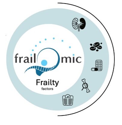
The poster layout refers to the look, feel, and organisation of elements in your poster. This encompasses the poster’s design elements and visual qualities, such as the colour palette, font choices, design style, contrast, and use of white space, as well as how information is laid out on the page [1,4]. You can see how each design element, the headline and accompanying text organised within a single vertical column, the bold, saturated image as the poster background, and the interplay between colours, is composed with a purpose. These stylistic choices are not merely aesthetic; they reinforce the design principle of visual hierarchy, which guides attention and supports efficient information processing [2,5].
With the right poster layout, content becomes not only visually appealing but also more persuasive and memorable [3,6]. Given that a poster provides a full visual canvas, designers have considerable freedom in layout choices. However, this freedom can be cognitively demanding, particularly when design principles are unfamiliar [5]. Numerous poster layouts exist, each suited to different communicative goals; below are some of the most common.
One column poster layout
A layout that organises information within a single column is one of the most widely used formats. These designs stack information vertically, supporting a natural top-to-bottom scanning pattern similar to how readers process text documents [7]. Even in the absence of strong imagery, single-column layouts can effectively sustain attention by reducing cognitive load and supporting readability [4,7].
Design tip: Choose bold fonts and font sizes to enhance legibility in minimalist designs.
Two column poster layout
Two-column layouts divide information into distinct visual zones, allowing designers to present more detailed explanations without overwhelming the viewer [2]. This approach is particularly useful when additional contextual or explanatory content is required to support understanding or persuasion, such as clarifying complex ideas or highlighting multiple attributes [6,8].
Double-column layouts are also well suited to information-dense materials, including infographic-style posters that aim to explain processes or narratives using combined text and visuals [5,6]. Segmenting information into discrete blocks improves comprehension and recall by helping viewers mentally categorise content [8].
Design tip: Use one or two accent colours to visually distinguish sections while maintaining coherence.
Multi-column or hybrid layout
Multi-column or hybrid layouts are effective when content volume is high, when multiple elements carry similar importance, or when several calls-to-action must be presented simultaneously [5]. These layouts benefit from visual markers, such as icons, which support faster recognition and reduce cognitive effort by leveraging pre-attentive visual processing [2,9].
Design tip: Use icons to represent steps or sections, increasing clarity and visual interest while breaking up text.
Six tips to consider when choosing a poster layout
Before beginning the design process, it is essential to clarify both the target audience and the intended outcome. Audience-centred design is a core principle of effective health communication and improves message relevance, comprehension, and engagement [3,6].
For example, if the goal of a poster is to encourage attendance at a conference, key information such as the event title, location, and a clear call-to-action should be prominently displayed. Additional details should be included only insofar as they support decision-making for the intended audience [3,8]. Early clarification of these factors helps determine whether a one- or two-column layout is more appropriate, reducing unnecessary complexity and supporting efficient communication [5,7].
Even with clear principles, designing a poster from scratch can be intimidating. Templates can provide a useful structural scaffold, allowing designers to focus on content while adhering to established layout conventions that support readability and attention [4,5].
Knowing these facts from the start will help you understand whether a one or two column layout is the right choice for you [10]. And yet, even with all these tips on hand, the thought of designing a poster from scratch can still be intimidating. That’s why a poster template will give you a solid foundation to create your own design! You can always simplify the process with a pre-made poster template like the ones we offer. Still confused then why not use our <<poster design selector>> for inspiration.
References
-
Houts PS, Doak CC, Doak LG, Loscalzo MJ. The role of pictures in improving health communication: a review of research on attention, comprehension, recall, and adherence. Patient Educ Couns. 2006;61(2):173-190.
-
Ware C. Information Visualization: Perception for Design. 2nd ed. San Francisco: Morgan Kaufmann; 2004.
-
McGuire WJ. Input and output variables currently promising for constructing persuasive communications. In: Rice RE, Atkin CK, editors. Public Communication Campaigns. 2nd ed. Newbury Park (CA): Sage; 1989. p. 22-48.
-
Bernard ML, Mills MM, Peterson M, Storrer K. A comparison of popular online fonts: which size and type is best? Usability News. 2002;4(1).
-
Tufte ER. The Visual Display of Quantitative Information. 2nd ed. Cheshire (CT): Graphics Press; 2001.
-
Mayer RE. Multimedia Learning. 2nd ed. New York: Cambridge University Press; 2009.
-
Rayner K. Eye movements in reading and information processing: 20 years of research. Psychol Bull.1998;124(3):372-422.
-
Sweller J. Cognitive load during problem solving: effects on learning. Cogn Sci. 1988;12(2):257-285.
-
Treisman A, Gelade G. A feature-integration theory of attention. Cogn Psychol. 1980;12(1):97-136.
- Niche Science & Technology Ltd. (2013). An Insider's Insight into Poster Presentations. [accessed June 2013].