


Start A Conversation
Click here to chat with me!
Search our website now
Latest Posts
Niche crafted a strategic communications plan for ApaTech's synthetic bone graft portfolio, translating preclinical science into compelling manuscripts, regulatory documents and conference publications ahead of its $330 million acquisition.
Niche provided Astex with expert regulatory writing across their oncology pipeline, delivering clinical protocols, study reports and safety narratives largely autonomously and to an exceptionally high standard.

When the original CRO walked out mid-trial, Niche stepped in to rescue and deliver this EU-funded, 74-site European study on frailty in older adults with type 2 diabetes.
Since 2014, Niche has run the executive function of this £9.6 million MRC-funded consortium, overseeing seven clinical trials across 13 academic centres to personalise severe asthma treatment.
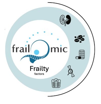
Niche built and coordinated the full communications strategy for this 20-institution European initiative, turning complex frailty biomarker research into compelling content for academics, policymakers and the public alike.